The Securitime Client Portal provides quick access to the performance of security guard vendors servicing your portfolio. This guide will provide you with basic navigation instructions of the platform and where to find frequently used functions.
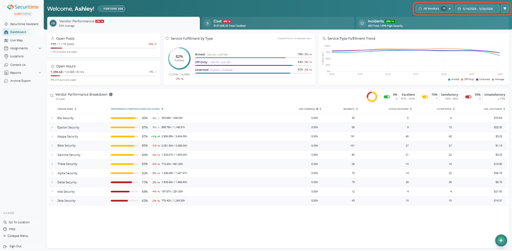
Dashboard Filters
Located at the top of the dashboard, filters allow you to customize the data displayed across all visualizations. Adjusting these filters updates the dashboard helping you focus on the most relevant information.
Note:
- Year-to-date (YTD) views are not affected by date filters. (Cost Tab is not affected by date filters).
- Data may be up to 24 hours old (this is an analytical, not operational dashboard).
Filters include:
- Security Providers
- Date range
- District
- Division
- Region
- State
- City
- Service Type
- Assignment Terms

Vendor Performance
The Vendor Performance Dashboard tab gives you a clear view of how effectively your vendors are meeting requirements. By comparing fulfilled (credited) hours to scheduled hours, the dashboard highlights coverage gaps, performance trends, and overall service reliability.
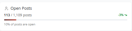
1. Open Posts
Understand how many positions remain unfilled.
- Visualizes the percentage of open vs. filled posts.
- Includes a trend indicator to show whether coverage is improving or declining over time.
- GREEN means there was a decrease in open posts.
- RED means there was an increase in open posts.
2. Open Hours
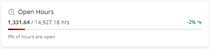
See the total number of scheduled hours that have not been fulfilled.
- Displays open hours as a percentage of total scheduled hours.
- Includes a trend indicator for the selected time.
3. Service Fulfillment by Type
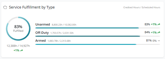
Track how performance changes over time.
- Chart showing overall fulfillment (credited vs scheduled hours)
- Progress bar breaking down performance by:
- Unarmed
- Armed
- Off-Duty
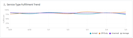
4. Service Type Fulfillment Trend
Track fulfillment trends over time.
- Line chart displaying trends for:
- Unarmed
- Armed
- Off-Duty
- Overall average
5. Vendor Performance Breakdown
Quickly evaluate vendor performance across key metrics.
Interactive toggles allow you to focus on specific performance levels.
- Excellent (Green 97% - 100%)
- Satisfactory (Yellow 80% - 96%)
- Unsatisfactory (Red 79% or less)
Select a Vendor for a more in-depth breakdown:
- Performance Score: Comparison of credited hours vs Scheduled hours
- Gap coverage: Gap hours within schedules assigned to a vendor.
- Active Locations/Posts: Number of locations or posts that had schedules within the time-period selected in the date filter. Multiple schedules with the same position name are counted separately (i.e., not counted as unique posts)
- Avg cost/hour: Average hourly cost per guard; rates vary by position, location, and other factors.
- Past 12 Month Performance: Vendor performance over the last 12 months starting from the current month. (not affected by master filter)
- Dark Hours Count: Total number of tardies, early outs, open posts, and missed clock outs.
- Punch Report & KPI Report: Buttons that open the reports with the current filters applied.
- Performance by Service Type: Unarmed, Off Duty, and Armed.

Cost
The Cost dashboard tab provides a comprehensive overview of portfolio spending and cost performance.
Note: Year-to-date (YTD) views are not affected by date filters. (Cost Tab is not affected by dashboard date filters).
1. Total Portfolio Overview
Displays:
- Total Actual Spent
- Credited Hours Cost
- Projected Cost
- Cost Variance

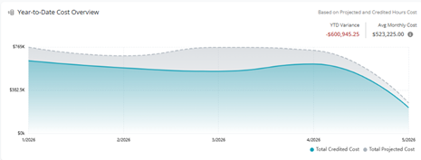
2. Year-to-Date Cost Overview
Provides a YTD comparison based on projected cost and credited hours cost.
- Includes YTD variance compared to average monthly cost.
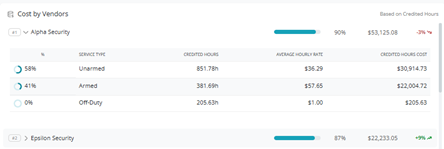
3. Cost by Vendors
Displays vendor costs based on credited hours.
- Expand a vendor row to view:
- Service Type
- Credited Hours
- Average Hourly Rate
- Credited Hours Cost
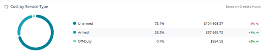
4. Cost by Service Type
Based on Credited Hours comparing cost by service type.
5. Cost by Assignment Type
Based on Credited Hours comparing cost by Assignment Type.

6. Cost by Area
Hover to see Projected Cost and Variance.
- Select the drop down to show:
- District
- Division
- Region

Incidents
The Incidents Dashboard tab provides visibility into incident activity across locations and service areas.
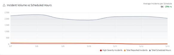
1. Incident Volume vs Scheduled Hours
Compare high severity incidents, total reported incidents, and scheduled hours over time.
- Avg incidents per schedule: average number of incidents reported across all schedules within the selected date range.
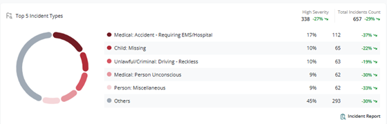
2. Top 5 Incident Types
Displays the five most common incident types.
- Select the Incident Report shortcut at the bottom of the widget to be taken to the full report.
- Shows trend indicator for:
- High severity
- Total incidents count.
- GREEN meaning there was a decrease in high severity incidents.
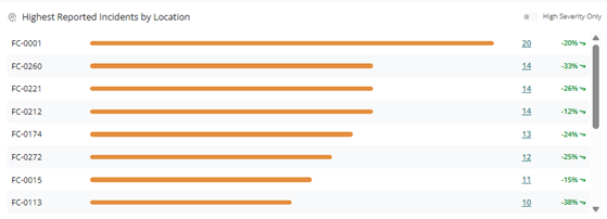
3. Highest Reported Incidents by Location
Displays locations with the highest number of reported incidents.
- Toggle High Severity Only to view locations with the highest severity incidents.
- Click on the incident count to open a side panel with incident details.
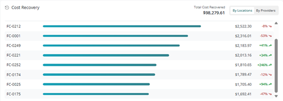
4. Cost Recovery
Displays the total dollar amount recovered by location or provider.
- Shows total cost recovered at the top of the widget.
- Trend indicators include:
- GREEN: an increase in recovery amounts
- RED: decreases in recovery amounts
5. Reported Incidents
Displays the most recent incidents within the selected date range.
Note: Data is at least 24 hours old.
- Click the incident ID to view side drawer with incident details.
- Enable High Severity Only to show only high severity incidents.
- Use the search filter to quickly locate incidents by keyword.

Was this article helpful?
That’s Great!
Thank you for your feedback
Sorry! We couldn't be helpful
Thank you for your feedback
Feedback sent
We appreciate your effort and will try to fix the article